So just recently it was announced that there was a new charting control out for .Net/Visual Studios so I thought I would give it shot. How hard could it be? Well considering it took me 2? years to figure out my Playstation 3 had a wireless card, an uphill battle wasn’t out of the question.
So what the hell has to be done first? Well you need the 3.5 Framework (Sucks if you don’t have that) and service pack 1 (Which doesn’t suck as much but still annoying. I WANT EASY THINGS).
Have those? Great, way to be in the know. Now for the next step, more downloads. Here is the charting install and you need this too to see the actual tool in your toolbox. AMAZING. Now you just have to run the installs, which oddly enough are easy to do. First time for everything.
So now you have them installed right? Ok well do the normal project create/startup, add a new page, and view Design. Go to the old toolbox and look under the Data tab. (Don’t ask me why it’s there because I don’t know and will be compelled to cut you.) Now under the chance you don’t see it there you either didn’t install the second download or you have to add the namespace the control falls under. No problem. Just right click the Data tab and select “Choose Items”. Now in the.Net Framework Components tab look for the Namespace “System.Web.UI.DataVisiualization.Charting” and you should see the name Chart to the right of it. Select that item.
Ok, so now there should be a Chart control in your ToolBox in the Data Tab. You can now drag that thing over. Now in the markup you should see:
<asp:Chart ID=”Chart1″ runat=”server”>
<Series>
<asp:Series Name=”Series1″></asp:Series>
</Series>
<ChartAreas>
<asp:ChartArea Name=”ChartArea1″></asp:ChartArea>
</ChartAreas>
</asp:Chart>
If that doesn’t excite you, then I don’t know what will. Anyhow, it’s actually very simple. Series is the line or whatever you are representing the data as and the chart area is what holds the series(s). Seems easy enough, but don’t worry, it gets easier. Now for this example I’m going to actually have two series and they are going to represent amount of weight Bench Pressed and the caloric intake for a given day. Best thing I could come up with right now since today was bench day.
<asp:Chart ID=”chartMain” runat=”server”>
<Series>
<asp:Series Name=”seriesBenchAmount” />
<asp:Series Name=”seriesFoodIntake” />
</Series>
<ChartAreas>
<asp:ChartArea Name=”chartAreaMain” />
</ChartAreas>
</asp:Chart>
Yeah that’s pretty good. So now what I need is to throw some fake data at it, and to do that I created a Bench table and a FoodIntake table followed by using Linq To Sql to create the needed classes. When all was said and done I could easily do this:
  private const String CHART_AREA_MAIN = "chartAreaMain";
  private const String SERIES_BENCH_AMOUNT = "seriesBenchAmount";
  private const String SERIES_FOOD_INTAKE = "seriesFoodIntake";

  protected void Page_Load(object sender, EventArgs e)
  {
    Bench[] benchList;
    Series currentSeries;
    FoodIntake[] foodIntakeList;

    benchList = Bench.GetAllBenches();
    currentSeries = chartMain.Series[SERIES_BENCH_AMOUNT];
    for (Int32 loopCounter = 0; loopCounter < benchList.Length; loopCounter++)
    {
      currentSeries.Points.AddXY(benchList[loopCounter].DateLifted,
         benchList[loopCounter].BenchAmount);
    }

    foodIntakeList = FoodIntake.GetAll();
    currentSeries = chartMain.Series[SERIES_FOOD_INTAKE];
    for(Int32 loopCounter = 0; loopCounter < foodIntakeList.Length; loopCounter++)
    {
      currentSeries.Points.AddXY(foodIntakeList[loopCounter].DateEaten,
          foodIntakeList[loopCounter].Calories / 10);
      }
  }
Now believe it or not, that’s all you have to do to get a graph. Pretty easy to say the least. Now the graph that you get will be default everything (And in this case it gives you a bar graph) but still at least that’s something to work with. (Note that I cheated with the food intake by dividing by 10. Unfortunately the graph would look odd with a day of 3500 calories and a 325 bench.)
Now maybe you want this to be a line graph… Whatever can we do?
protected override void CreateChildControls()
{
    base.CreateChildControls();
    Series currentSeries;
    ChartArea currentArea;

    currentSeries = chartMain.Series[SERIES_BENCH_AMOUNT];
    currentSeries.XValueType = ChartValueType.DateTime;
    currentSeries.YValueType = ChartValueType.Int32;
    currentSeries.ChartType = SeriesChartType.Line;
    currentSeries.BorderWidth = 3; currentSeries.MarkerStyle = MarkerStyle.Square;

    currentSeries = chartMain.Series[SERIES_FOOD_INTAKE];
    currentSeries.XValueType = ChartValueType.DateTime;
    currentSeries.YValueType = ChartValueType.Int32;
    currentSeries.ChartType = SeriesChartType.Line;
    currentSeries.MarkerStyle = MarkerStyle.Circle;
    currentSeries.MarkerColor = Color.Red;
    currentSeries.BorderWidth = 3;

    currentArea = chartMain.ChartAreas[CHART_AREA_MAIN];
    currentArea.Area3DStyle.Enable3D = false;
}
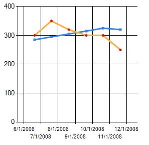
So what’s all this? Well this:

So pretty, yah? So what does it all mean?
    currentSeries.XValueType = ChartValueType.DateTime;
    currentSeries.YValueType = ChartValueType.Int32;
Well this is pretty simple, this merely sets the types for the X and Y axis. I told you it was simple.
currentSeries.ChartType = SeriesChartType.Line;
If you can’t figure that one out, try another profession like engineering.
    currentSeries.MarkerStyle = MarkerStyle.Circle;
    currentSeries.MarkerColor = Color.Red;
Ok these three things are used to control how the points on the lines (Markers) actually look. Pretty self explanatory once the word “marker” is translated.
currentSeries.BorderWidth = 3;
This is the thickness of the line itself.
currentArea.Area3DStyle.Enable3D = false;
If you guessed this was a way to make the grid 3d, you were right on and probably able remind yourself to breathe at a maximum 3 times a day.
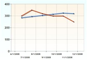
So now you are thinking you have this down to an expert level and I say,”sure why not?” ‘cept with a little work on the mark up I could make it look like this:

And just like Beloch said in Raiders of the Lost Arc before his face exploded, “It’s Bewtifewl!”
Now for the Usings!!11
    using System;
    using System.Drawing;
    using System.Web.UI.DataVisualization.Charting;
And the final markup:
<asp:Chart ID=”chartMain” runat=”server” Palette=”EarthTones” BackColor=”Azure” ImageType=”Jpeg” ImageLocation=”~/ChartImages/ChartPic_#SEQ(300,3)” Width=”412px” Height=”296px” BorderDashStyle=”Solid” BackGradientStyle=”TopBottom” BorderWidth=”2″ BorderColor=”181, 64, 1″>
<series>
<asp:Series Name=”seriesBenchAmount” MarkerSize=”3″ BorderWidth=”3″ ShadowColor=”Black” BorderColor=”180, 26, 59, 105″ Color=”220, 65, 140, 240″ ShadowOffset=”2″ />
<asp:Series Name=”seriesFoodIntake” MarkerSize=”3″ BorderWidth=”3″ ShadowColor=”Black” BorderColor=”180, 26, 59, 105″ Color=”220, 224, 64, 10″ ShadowOffset=”2″ />
</series>
<chartareas>
<asp:ChartArea Name=”chartAreaMain” BorderColor=”64, 64, 64, 64″ BorderDashStyle=”Solid” BackSecondaryColor=”White” BackColor=”OldLace” ShadowColor=”Transparent” BackGradientStyle=”TopBottom”>
<area3dstyle Rotation=”25″ Perspective=”9″ LightStyle=”Realistic” Inclination=”40″ IsRightAngleAxes=”False” WallWidth=”3″ IsClustered=”False” />
<axisy LineColor=”64, 64, 64, 64″>
<LabelStyle Font=”Trebuchet MS, 8.25pt, style=Bold” />
<MajorGrid LineColor=”64, 64, 64, 64″ />
</axisy>
<axisx LineColor=”64, 64, 64, 64″>
<LabelStyle Font=”Trebuchet MS, 8.25pt, style=Bold” />
<MajorGrid LineColor=”64, 64, 64, 64″ />
</axisx>
</asp:ChartArea>
</chartareas>
</asp:Chart>
Hey! Now I don’t have to feel idiotic anymore. Your expanations did really well in teaching me how to draw up some charts in ASP.Net.
Love the sarcasm, great writing style. Â Nice tutorial 🙂 Â